I spent 3-4 hours redesigning this blog. Thanks for the "fleur" template to J. Maloney and Blogcrowds.
Let me know if you like it.
Showing posts with label Design. Show all posts
Showing posts with label Design. Show all posts
Sunday, September 13, 2009
Tuesday, April 1, 2008
Open- o Closed-Source pari sono
Il supporto all'editing tramite documenti Master in OpenOffice è a dir poco imbarazzante: nella migliore delle ipotesi non funziona, nella peggiore... pure.
Insomma a dirla tutta o è spaventosamente buggato o non è stato proprio implementato...
Sul versante Closed-Source le cose non cambiano: Word 2003 è proprio buggato... dal SP1 in poi!
Infatti prima che applicassi il SP1 e il SP2 tutto funzionava meglio (non "bene" si noti... "meglio" o "meno peggio").
E figuratevi se le cose le hanno aggiustate con Office 2007... si vede lontano un miglio che non è altro che un Office 2003 con una diversa interfaccia grafica...
Ora mi sto chiedendo: solo io quando scrivo del software lo testo approfonditamente per evitare simili figure di £$%*# ?!?
Consiglio: se dovete realizzare layout complessi o, almeno, professionali non usate ne l'uno ne l'altro.
Basta elaborare il testo dove volete voi (anche BloccoNote va bene) e poi usare per l'impaginazione i programmi che sono specificatamente pensati per fare impaginazione (sembra ovvio, ma non sempre lo è).
Consiglio Scribus e, se proprio volete fare il botto, InDesign. Punto.
Thursday, January 17, 2008
Tuesday, December 18, 2007
TMIG project: front-page illustration
TMIG project front-page turned out to be quite inspiring.
I think the good design of the red graphic element is the main reason for such a plenty of different versions I came to:
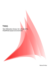
The one above has been the first to be printed... good, but after a while I found myself disappointed by its lack for minimalism. Well, I do find it minimal... but not enough!
So a new version made to light:
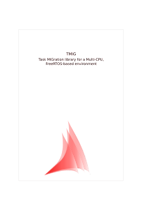
Especially for this last one I came to three different solutions (that I don't insert here to avoid an intoxication to you): one without the grey box (click and zoom the image if you don't see it), one with simply my name added and others with different reciprocal positions for the text and the graphic element.
Do you wanna see more? Are you really sure you want to? Post in the comments and I'll upload other solutions I came to.
Sunday, October 28, 2007
Vodafone 1 - Flash 0
190.it finalmente si rinnova: minimal, semplice, comprensibile e finalmente con molto meno Flash...
Personalmente avrei usato dei bordi arrotondati qua e la, ma mi piace molto lo stesso (specie se confrontato con la precedente, orribile versione).
Mi sembra che il tutto non sia ancora nella sua versione definitiva (alcune pagine intermedie sono ancora a metà tra la vecchia grafica e la nuova), ma siamo decisamente di fronte a un miglioramento eccezionale.
Qui una presentazione delle novità: http://www.experience.vodafone.it/new (argh! questa per forza in flash)
Thursday, September 20, 2007
Open source is makin' me loose my temper
UPDATE:
Try InkScape: is way much better than Gimp when it comes to editing box, lines, gradients and, in general, simple linear patterns.
(But it's buggy, too... grrrrr!)
ORIGINAL:
Pleas someone tell them to simply make Gimp work: I've spent the last 40 minutes trying to draw 3 (T-H-R-E-E !!!) bands on the upper right corner of an A4.
Selections that, when moved, move the entire layer instead of just what they are meant to select (why call them "Selections" if they don't "select"?!?), the ridiculous elaboration speed of a "Fill" operation (I was simply filling the entire A4 surface with a plain colour and it took me about 5 seconds!), the total absence of a "transform selection" command (instead, you have to play with mysterious options of the transformation tools option-box)... and other frustrating ones.
And someone dares to compare Gimp to Photoshop!!!
Please "open-source guys", less buzz-words, less auto-contratulating on minimal things, less religion wars, less "Winzozz" and "M$"; please start taking your work seriously, and stop harming users with your incompetence!
Tuesday, September 18, 2007
Il nuovo logo Photoshop
Diciamocelo: il nuovo logo di Photoshop fa un po cagare...
Qui nel contesto di una magnifica pagina che pubblicizza l'intera famiglia di prodotti Photoshop: notare lo stridio generato dal validissimo layout della pagina, il design dell'animazione flash (anche se 4-5 dei personaggi sembrano un filino "soggetti" con le spalle un po troppo chine) e quello delle confezioni dei prodotti poco più sotto, tutti contro il nuovo logo...
Che dire: capita anche ai migliori di sbagliare.
Subscribe to:
Posts (Atom)